Here's an interesting little side-note to my ongoing disgust project: how to design a cover for a book about disgust? As I've been gathering together texts for the project, it's occurred to me that a designer working on a cover for a disgust book faces what could be a unique challenge: to communicate the content of the book by evoking disgust, while at the same time making the cover aesthetically appealing enough that a reader will actually pick the book up, rather than turning away in revulsion. It seems to me that no other emotion is by definition quite so difficult to reconcile with an advertising-style consumer appeal. Anyway, I thought it might be fun to look at a few different solutions to this dilemma.

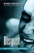
Solution #1: Instead of showing the disgusting object, show a person feeling disgust. It's an easy emotion to recognize, since, as both William Ian Miller and Robert Rawdon Wilson point out, "disgust face" (wrinkled nose, drawn-back top lip, extended tongue) seems to be pretty universal, even cross-culturally. I think it's interesting that in both these cases, the look and the disgusted person are themselves clean and inoffensive. The bodies portrayed are young, white, slender, and privileged (the man is wearing a suit) with not too much hair in the frame and skin that appears smooth and matte. The monochrome treatment of the photographs reduces their visceral quality—particularly that of the tongue on the Menninghaus cover, which is further neutralized by having the book's subtitle plastered over it. The monochrome also gives a faintly retro feel, especially to the man on the cover of the Kelly book. Both are without any specific visual background for context, which further reduces their immediacy.
In the Kelly image, the man seems to be disgusted at a glass of water or other clear liquid. We can imagine that he took a swig of gin when expecting water, or that he has added a few drops of foul-tasting medicine to his drink, but in general clear water is one of the least contaminating substances around. Whatever the man's source of disgust with his water glass, it's unlikely to infect the viewer.
I'd like to add that although I find both of these particular examples a bit "blah," inoffensive but not particularly appealing, there's no reason the "disgust face" cover couldn't be more striking if executed differently.


Solution #2: Portray the author, not the subject. Also used for plenty of Freud covers. Julia Kristeva may have written about the psychology of disgust and horror at the separation of mother from infant, but you can't tell by looking at her photograph, which depicts an earnest, thin, clean-looking white lady engaging in what appears to be thoughtful conversation, her mouth picturesquely forming a word and her head resting gently on her hand. The image of Kant communicates even less about him: a pensive eighteenth-century white gentleman with an emphasized cranium—the seat of both "judgment" and "critique," presumably. I'm guessing that the strongest attractive trait of a cover like this, is that anyone looking at the book will know that one is reading Kristeva, Freud, or Kant: bragging rights, in other words. (Although in the case of the Dover edition, we all know the most attractive thing about them is how delightfully affordable they are, which makes the lack of appealing covers pretty much beside the point.) Otherwise, these covers are fairly bland and communicate little about the themes or ideas addressed.

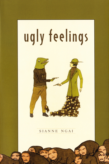
Solution #3: Depict an object that could be disgusting, but in such an aesthetically appealing way that the attraction overcomes the repulsion. This is obviously a more subjective and riskier option, since the tipping point between aversion and attraction will be different for different people. Personally, though, both of these covers work well for me. They both communicate something about the content of the books, which in both cases has to do directly with unpleasant emotions including disgust; at the same time, they're both visually interesting and appealing enough to attract my interest even if I didn't know their subject matter. Unlike the covers we've looked at so far, these both use rich, bold color schemes and lettering that's integrated with the images. Unlike the covers above, they both portray objects that could actually be considered disgusting: a warty, tentacle-laden frog for the Korsmeyer, and a whole collection of deformed bodies (frog-headed man, woman with a body made up of tiny monsters) for the Ngai. Since it's a bit difficult to make out what's going on with the Ngai cover, here's a larger version:
I think this is actually quite disturbing! The humpy little four-legged beasts with human faces that make up the lower part of the woman's body and also mass across the bottom of the cover, violating the neat boundary between the green outer frame and the cream inner rectangle, are particularly grotesque, and their vast number only makes them more so. Malfunctioning and/or deformed bodies are traditionally a potent source of disgust, especially, as in the example of the little monster biting the toad-man's leg, when the boundaries between bodies are breached.
Yet both these covers manage to be (I think) aesthetically appealing overall—and they use some of the same tricks as the previous covers we've seen. Both reduce the visceral quality of the disgusting objects by evoking an antique (Korsemeyer) or retro (Ngai) feeling, whether by evoking classic biology texts with the line-drawing style of the frog, or by gesturing toward the fashions of bygone eras with the hat, coat, and hairstyle of the gun-wielding woman. The use of color, too, echoes that in the previous covers: the warts and tentacles on the Korsmeyer frog are rendered less visceral by being shown in two-tone green-on-green, and the unified olives, creams, and browns of the Ngai cover make the scene depicted less jarring. Both the gesture toward the old-fashioned and the flattening into simple, pleasing color schemes have the effect of distancing the viewer from the possible source of disgust—and any extra distance decreases the sense of threat and contamination that goes with disgust. These covers remind us we're looking at a representation rather than an in-the-world disgusting object, which allows us to appreciate them from an aesthetic point of view.

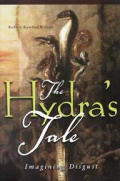
Solution #4: Depict a non-disgusting aspect of the object of disgust. Both of these covers depict directly the object of disgust (the working, unwashed poor in the case of Orwell; the mythological Hydra in the case of Wilson), but they choose to portray a non-disgusting or less disgusting view of those objects. The poor folks on the Orwell cover look tired and dirty, but they are seen in the cleansing outdoors rather than inside their contaminated hovels, and their bodies are encased in long coats, decreasing their contact with the viewer. Certainly there is nothing in this cover to suggest the scenes of filth, food, and stench that so troubled Orwell (his host, for example, serves him bread with a thumb blackened from emptying chamber pots). Likewise, Wilson in his book discusses how the Hydra is an excellent symbol of disgust because of the decay and stench it leaves in its very footsteps; yet what is depicted here is several heads, not the rot and decay associated with it. Both many-headedness and the dirt of poverty could potentially be disgusting, less so than other facets of the same objects. What's more, these particular depictions don't push for the disgust reaction: the hydra's heads, for example, are shown upright and separated from one another, rather than slithering in an undifferentiated mass, and the design's lettering comes between the heads and the viewer.
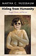
Solution #5: Go ahead and depict the unattractive object even though it may alienate readers. In ways I think this is the most honest solution to the whole problem of covering disgust, and particularly appropriate for Nussbaum's book, since she is arguing (as I understand it; I have yet to read this) that allowing ourselves to be ruled by our feelings of shame and disgust is morally suspect and philosophically unsound. What's more, the person depicted is not particularly repulsive—merely a nude white lady whose body, with its dark under-eye patches, pendulous breasts and mild degree of flab, does not conform to social ideals of beauty. As almost all of us similarly fail to conform to beauty standards, Nussbaum's cover suggests one problem with allowing ourselves to act on our disgust for this woman: namely, that we are setting ourselves up to be objects of disgust in turn, and that almost everyone would receive the same treatment in this woman's place. Since Nussbaum is making a moral argument for confronting our assumptions about what it means to feel disgust, and what conclusions we can and cannot draw based on that feeling, I think this is a fairly representative cover, despite its lack of aesthetic appeal.

Solution #6: Gesture toward the idea of contamination directly, rather than depicting an object. I think this cover is so clever: rather than working to reassure the viewer that she is seeing a representation rather than an in-the-world disgust object, it breaks down the "fourth wall" and creates the illusion that the corner of this pristine grey-on-white book has been soiled. The viewer/reader's emotions in the moments before she realizes the illusion might run the gamut from disappointment and frustration to judgment and revulsion—which range is a pretty good representation of our reactions to "filth" in the world more generally. Although I haven't read this yet, I can imagine that having this little experience before I ever pick up the book, might be a more accurate preview of what I'll find inside than most covers can provide. At the same time, the suggestion of unspecified dirt on the cover is not extreme enough to deter most readers from picking up the book, especially as the rest of the layout is appealingly clean and minimalist.
What did I miss? Do any other disgust-related covers leap out at you? I was surprised at the degree to which analyzing these covers brought up many of the issues I've been reading about in the actual texts!


How interesting. Given that there has been a lot of annoyance expressed (quite rightly!) in the blogworld that publishers will choose to depict white people on covers of books about ethnic minorities, it's intriguing to see how they risk portraying disgust. I have the Nussbaum, as you know, and find the stare of the woman particularly disturbing. It's almost tempting to cover her up with another book at times - for both our sakes! That last one is also a clever solution, with the idea that the book itself has become soiled. And the woman with mutant creatures for legs is very nightmareish, too.
Yes, I debated with myself while looking at these about whether the predominance of white people here means anything in particular, given the fact that they predominate so hugely on book covers in general. I'm still not sure. Pick any ten books at random published in the US/UK and they're likely to all picture white folks.
And I know what you mean about the Nussbaum book! one wants to put the poor lady out of her obvious discomfort with the state of being gazed at.
Great roundup/analysis, sweetie!
Two things leap out at me:
One: "a warty, tentacle-laden frog for the Korsmeyer"...
I think this is a really interesting cover for a number of reasons, but one is expressed in your description of it. Though the image does give the impression of involving tentacles, I believe that those are actually the dangling ends of the worm or worms the frog is eating. To me, it's a kind of clever and gentle nod towards the subjectivity of disgust, and to the titular notion of savoring it.
Two: Explaining the joke makes renders it un-funny (harmless).
Contrary to the inverse relationship of exegesis and comedic value, your analysis of the covers which obscure disgust in some way actually made them, and by contaminating extension, the books to which they are attached, seem more disgusting. It might be at least in part an artifact of my obsessive-compulsive leanings, but I found your repeated use of the word "contaminating" in its various forms, well, contaminating.
Conversely, on the covers which do less to obscure disgust, but rather, try to portray a potentially disgusting object or scenario, but in a frank, even bold fashion, your explorations made the images, if anything, less disgusting.
So, I propose a formula: Analysis amplifies disgust if the object or cause of the disgust is hidden, has a gentling effect on disgust if the object is explicit. How do those apples strike you?
Mmmm, worms!
Analysis amplifies disgust if the object or cause of the disgust is hidden, has a gentling effect on disgust if the object is explicit.
William Ian Miller talks in An Anatomy of Disgust about how the mental apparatus around the disgusting is rigged up to either warn us that something that seems fair is really foul (a beautiful human actually has some kind of deformity, for example - an instance of your "hidden cause" of disgust), or to signal to us that something that seems foul is really fair (the push-and-pull fascination we feel with picking a scab or behaviors our society has classified as deviant - and maybe an example of your explicit disgust object?). So with disgust, there's often a recoil in the opposite direction of our initial impulse. If the initial impulse is to recoil, it's often accompanied by a force of fascination that pulls us back, whereas if our initial reaction is to get closer, it's often accompanied, as more detail emerges or we get sated, with the desire to pull away. In other words, I like your theory! :-)
While I think all those covers avoid the issue visually so to speak, the only really disgusting cover I can think of* is the paperback of this nonfiction book called Parasite Rex that my brother lent me years and years ago. Looking at the thing on Google images tonight after downing a 22 oz. pumpkin ale, it doesn't look all that disturbing--but the (airbrushed?) close-up of a monster bug used to gross me out a tad while I was reading the damn thing. Of course, the text was disgusting and fascinating in equal measure and my brother's copy was so beat up I imagined there could be microscopic parasite larvae crawling all over it!
*I don't count romance novel covers featuring big pec Fabio lookalikes as digusting although I prob. should; ditto all the garish purple covers I see on teen paranormal titles and the like!
Ew, that does sound disgusting!
I think these covers are interesting because they wouldn't want to be REALLY disgusting, would they - I mean, they're primarily scientific/theoretical treatises, which only happen to be on the subject of disgust. So their first task is to attract the kind of people who read scientific/theoretical treatises, and expressing their actual subject matter takes second place. It would be interesting to look at covers of books for which being really disgusting would actually be a selling-point - horror leaps to mind. Although a quick Google image search reveals more that strike me as silly than ones that seem actually disgusting.
Whoa. WHOA! The cover of Ugly Feelings is so spooky! But as you point out, I rather like it. On the other hand, I would have to hide the Nussbaum book if I had it in my house - and cover it with something if I was reading it. Just a glance at the cover is enough to make my glance uneasily round the house. Yikes. Not sure where fear fits in with disgust...? Very interesting post!
Yeah, isn't the Ngai cover interesting?
The intersection of fear and disgust is pretty interesting, isn't it? It seems to me that if disgust gets too intense it morphs into terror, at which point one's attention is distracted from the disgust feelings. Of course, underlying disgust is often that fear of contamination, so they can definitely coexist...
Fascinating analysis of the book covers! I never would have thought of examining them like you have. That Ngai cover is definitely disturbing.
Glad it was interesting, Stefanie! Yes, the Ngai cover is disturbing yet oddly compelling as well.
I'll bet plenty of sweat and worry went into those covers! I'm thinking you've covered the possible categories very well. Of all your examples, I find the Ngai the oddest -- it does match the book's title quite well!
I know, I bet there was some serious board room brainstorming that went into some of these. I'm glad people share my fascination with the Ngai cover - it's certainly one of the more intriguing here.
I really enjoyed this approach to the books! I have to say, I think (hard to tell without seeing it in the flesh, so to speak) I find the last one most disturbing, perhaps because that stain isn't obviously an image, as the others are. And it sort of compels one to touch it to find out, which is a cunning marketing ploy as well, albeit only one which would work in a bookshop.
Interesting, Helen - that makes sense, and I like your point about compelling the viewer to reach out and examine the book. When I first looked at the image I thought something was wrong with my screen, so I imagine one would go through a similar process in person as well. I wonder if they texturized the "dirty" section at all, with embossing or some other treatment.